- Corner chat launcher polished: theme-matched avatars, a quieter header, a clearer error state
- The 'AI assistant, never moves money' disclosure now has its own fixed row above the conversation
- The launcher icon uses its own file so toggling it can no longer pause animations elsewhere on the page
The homepage carries a chat launcher fixed to the bottom-right corner, letting a visitor ask a question about the product, the platform or pricing without leaving the page. It has had a pass of polish: theme-matched avatars, a consistently sized panel, a quieter header, and an error state that actually reads as one rather than failing silently.
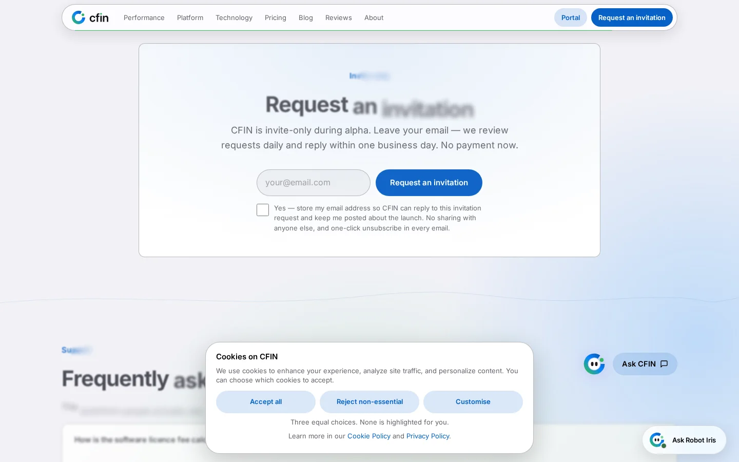




Opening it
Selecting the bubble opens a fixed panel with the assistant's name and status at the top (“Robot Iris”, “Online”), a short standing disclosure, and the conversation itself below. The avatar in the header, and the glyph on the launcher bubble, both swap between a light and a dark version depending on your current appearance setting — rather than one image forced onto a background it was not drawn for.
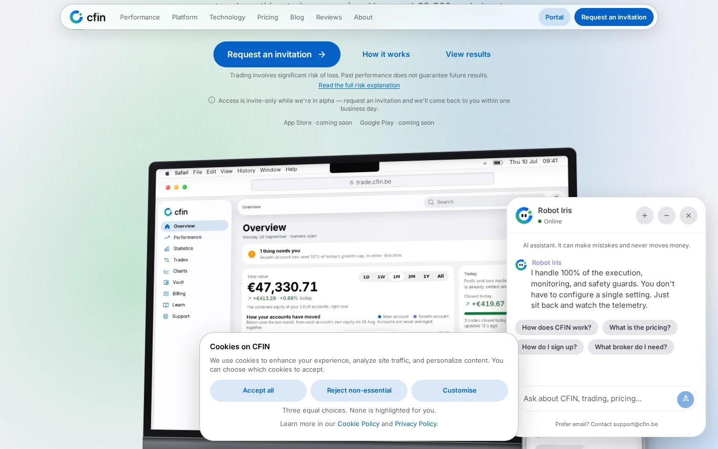
The disclosure stays visible
One line sits above every conversation, every time, and does not scroll away with the messages: “AI assistant. It can make mistakes and never moves money.” It used to be folded into the header alongside the online status and two buttons, which crowded the header and made it easy to miss. It has its own row now, out of the header, where it is the first thing you see when the panel opens.
What the controls do
- A “New conversation” control clears the current thread and starts again.
- Minimise collapses the panel without ending the conversation.
- Close hides the panel; the bubble stays in the corner to reopen it.
A small, specific technical fix behind the avatar
The launcher bubble's icon uses its own distinct image file rather than reusing the exact same file as the larger Iris mark elsewhere on the page, and that is deliberate rather than incidental. Some browser engines back every on-screen image that shares one file with a single underlying animation timeline — so pausing or hiding any one instance of it, such as the launcher bubble toggling in and out of view, could previously stop the animation for every other instance of the same mark on the page, including the large one in the hero section. Giving the launcher its own file avoids that: toggling the chat open and closed can no longer affect an animation playing anywhere else on the page.
How to use it
- Scroll to any point on the homepage — the bubble stays fixed in the corner as you scroll.
- Select the bubble to open the panel.
- Type a question about the product, the platform or pricing; the assistant answers from what is published on the site.
- Use “New conversation” if you want to start over, or close the panel and the bubble will still be there when you come back.
The chat widget is currently a homepage feature rather than something carried on every public page. It sits alongside, not instead of, the FAQ and the fee calculator — for a question with a definite answer, those stay the more direct route.
A wider bubble, and a fixed panel size on phones
The message bubbles inside the conversation were widened, giving longer answers more room to wrap comfortably rather than running narrow down the centre of the panel. On a phone specifically, the panel now opens to one fixed, full height rather than a size that could vary depending on content — a small consistency fix, but one that matters for a panel you are likely to open and close repeatedly across a single visit.