- Blog index now has a search box plus category and product filter rows
- The product filter lets you isolate posts about Website, App, Iris or Admin
- Filtered views are shareable links; no existing post's URL changes
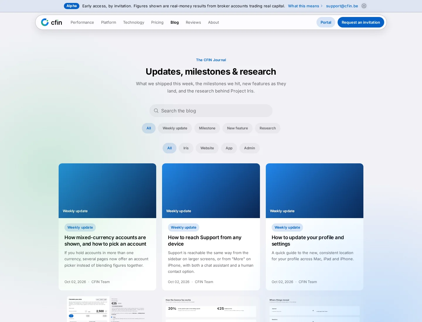
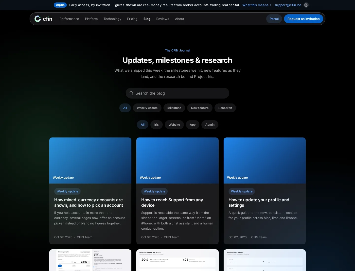
With more than fifty posts now published, finding a specific update on the CFIN blog meant scrolling. The blog index now carries a search box and two separate filter rows, so you can narrow the list down before you start reading.




Searching
The search box at the top of the blog takes a plain text query and matches it against post content, not just titles — so searching for a specific feature name or phrase can surface a post even if that exact wording is not in its title. A clear control next to the box resets the search without having to delete the text by hand.
Filtering by category
The category row lets you narrow the list to one of the blog's existing categories — Weekly Update, Milestone, New Feature or Research — or back out to All. Selecting a category updates the grid at once and marks the active choice so it is clear what you are currently viewing.
Filtering by product
A second row filters by product area: All, Website, App, Iris or Admin. This is the filter to reach for if you specifically want posts about the public site and app redesign, as opposed to updates about the trading engine or the admin tools behind the scenes.
Combining search and filters
- Type a search term, select a category, select a product — any combination of the three can be active at once.
- The grid updates to show only posts matching everything you have set.
- If nothing matches, the page says so plainly and offers a link to clear every filter at once.
- Because the filters and search term are carried in the page's address, a filtered view can be copied and shared as a link that opens to the same results.
Why this was worth adding
A blog documenting detailed, incremental updates is only useful if a reader can find the one post they actually want. Scrolling through every post in publication order worked while there were a handful of them; past fifty, a reader looking specifically for, say, every post about the website redesign needed a way to ask for exactly that — which is what the product filter is for.
No existing post's URL changes because of this — the filter and search are additive ways to browse the same set of posts, not a restructuring of where any individual post lives.
Paging through results
Where a filtered or unfiltered view runs past one page of posts, a pager at the bottom lets you move between pages — a simple Newer and Older step either side of the numbered pages themselves, with the current page marked. Posts without a cover image show a flat, category-tinted tile with the category name in the corner instead, so a card is never left visually blank while still carrying the same filter and search metadata as every other card in the grid.
When nothing matches
If a search term and filter combination together match nothing, the grid is replaced with a plain message saying so, next to a link that clears every active filter and search term at once — a single step back to the full, unfiltered list rather than having to reset each control individually.
Both filter rows are labelled for assistive technology
Each of the two filter rows carries its own accessible label — “Filter by category” and “Filter by product” — and the currently active option in each row is marked as the current page in the accessibility tree, not only highlighted visually. That matters specifically because the two rows sit close together and use a near-identical visual style; without a distinct accessible label for each, it would be easy for a screen reader to describe both rows identically, leaving no way to tell which filter had actually narrowed the results.