- Floating header controls follow concentric geometry: a pill inside a pill
- Dashboard layouts widen on large and ultrawide screens instead of stopping at a fixed width
- Content cards are flat; the translucent material is kept for navigation chrome
- Refined responsive layouts across Desktop (1440/1920px), iPad (768/1024px), and iPhone (375-430px) with touch-first 44px hit targets
Today we are rolling out a major visual and architectural refinement across the entire CFIN platform, moving public pages and dashboards closer to the principles in Apple’s Human Interface Guidelines (HIG). Parts of the product are still moving; see the redesign posts for page-by-page status. This update addresses visual geometry, dynamic layout scaling, and material design consistency across all device form factors.
Concentric capsule geometry in floating controls
In Apple design philosophy, nested rounded elements must follow geometric concentricity: an inner control sitting inside a rounded container must match or harmonize with the outer container's curvature (inner radius = outer radius minus the gap between them). Previously, the floating site header used a 9999px pill capsule outline, but nested navigation links and CTA buttons utilized standard 12px rounded rectangular radii, creating an awkward visual tension.
With this release, all controls hosted inside the floating header capsule—including the brand logo, navigation links, client portal triggers, and mobile drawer toggles—strictly adopt full capsule pill geometry (border-radius: var(--radius-full, 9999px)). The result is seamless visual harmony and consistent concentric spacing.
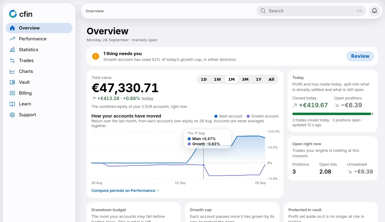
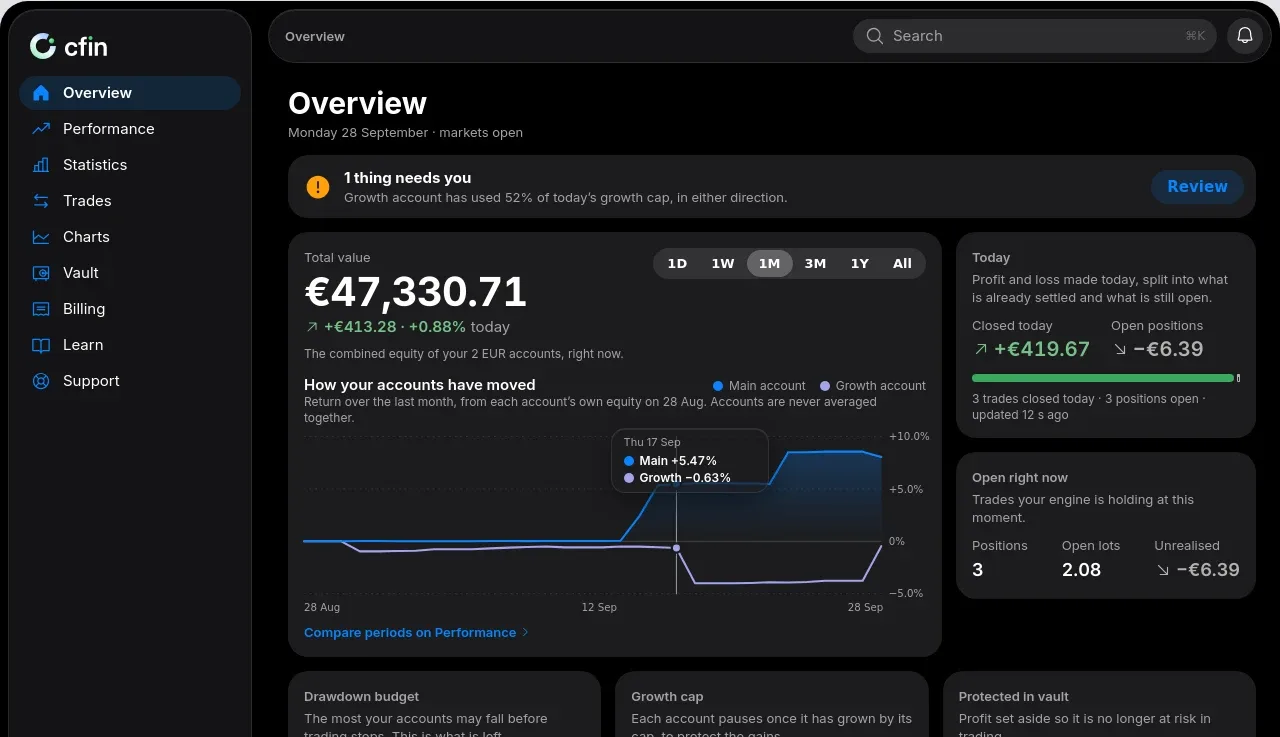
Fluid grids on ultrawide monitors
High-resolution trading desks frequently operate on 27-inch 4K monitors or 34-inch ultrawide displays. Previously, fixed container bounds of 1200px or 1400px created excessive empty margins on wide monitors, restricting data density. We have refactored the layout engines in both dashboard.css and admin.css:
- Dynamic Width Scaling: Layout containers now expand dynamically to
min(100%, calc(100vw - 48px)), utilizing the full breadth of wide screens while preserving comfortable 24px/32px side gutters. - Dynamic Auto-Fit Grid Columns: KPI cards, trading equity curves, open positions, and account health widgets now reflow automatically using CSS Grid
repeat(auto-fit, minmax(280px, 1fr)), ensuring that no card or square feels sparse or stretched. - Table Fluidity: All data tables are wrapped in responsive containers with sticky column headers and smooth touch scrolling on smaller viewports.
Flat cards, glass only on chrome
The cards that hold your figures are flat: no shadow and no border by default. The frosted, translucent material is reserved for chrome, such as the floating header, and is not used on content cards. A hairline border returns only when your device asks for higher contrast, so a high-contrast user still gets a boundary around each card. From the card style sheet:
.card {
  background: var(--color-background-card);
  border-radius: var(--cfin-card-radius);
  border: 0;
  box-shadow: none;
}

@media (prefers-contrast: more) {
  .card { border: 1px solid var(--cfin-separator-opaque); }
}
What this post does not claim
An earlier version of this post described status badges and gauges on dashboard cards. Those descriptions did not match the dashboard as it is today, and one of the labels read like a verdict on trading results, so they have been removed. The figures on your Overview and Performance pages are described in their own posts, each with its definition. Layout changes here are presentation only: they do not change any figure, limit or setting on your account.