- Sign-in order on iPhone is fixed: Apple first, then Google, then email and password
- Fields built to a 44px minimum height; sign-in and social buttons to 50px pills
- Registration's first step gets the same field sizing and spacing treatment
The sign-in screen at trade.cfin.be has had a pass aimed squarely at iPhone: field sizing, button order, and the gap between controls, all checked specifically at phone width rather than only on a desktop viewport and assumed to scale down cleanly.




The order, and why
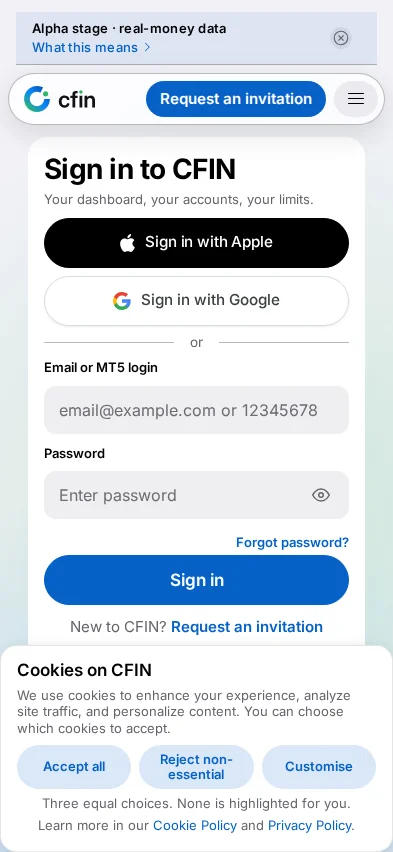
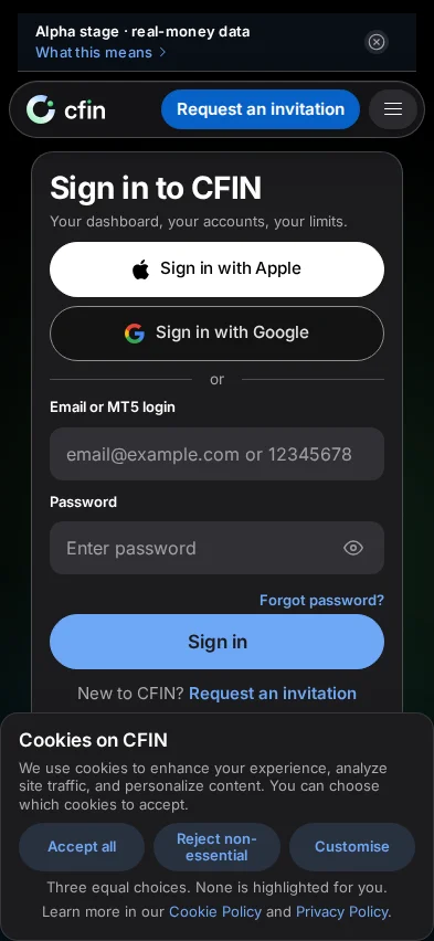
Three ways to sign in are offered, in a fixed order: Sign in with Apple first, as a full-width black capsule; Sign in with Google directly beneath it, the same width and shape; then a plain “or” divider, below which sit the email-or-MT5-login field and password field. Anyone who originally signed up with Apple has no other path in, which is part of why it leads.
Field and button sizing
Form fields are built to a 44px minimum height, and the sign-in and social buttons to a 50px pill with consistent spacing between them. That sizing is not arbitrary — it is the same minimum comfortable target size used across the redesign's accessibility pass, applied here because a sign-in screen is disproportionately likely to be the first thing a new visitor touches on their phone.
What appears below the form
Underneath the sign-in button sit a “Forgot password?” link, a prompt to request an invitation if you are new, and a compact footer with the risk disclosure, the legal entity, and links to terms, privacy, EU consumer redress and the main site. A “Clear session & start fresh” link and a cookie-preferences link sit at the very bottom — covered in more detail in a separate post.
Appearance
The screen follows your device's light or dark appearance setting automatically, the same as the rest of the public site, rather than offering a separate toggle of its own on this particular page.
Smaller details worth naming
A deliberate gap now separates the Apple and Google buttons from each other, rather than the two sitting flush together as if they were one control with a seam down the middle. The “Forgot password?” link uses the site's accent colour so it reads clearly as a link rather than plain text, and the main Sign in button's label is sized at 17px, large enough to read comfortably without the button itself needing to grow disproportionately. A short, non-statutory line of small print sits below the card itself, separate from the formal risk disclosure and legal entity line in the footer beneath it.
A header pill that does not overflow
The compact header shown above the sign-in card on narrow phones was previously prone to its buttons stretching to fill the entire width of the pill-shaped container around them, crowding whatever else shared that space. The buttons now keep their own natural width inside the pill rather than being forced to fill it, which keeps the header legible even on the narrowest supported phone widths.
Registering, not only signing in
The same attention to field height, button sizing and spacing carries across to the registration flow's own first step, which offers Google directly alongside the standard name and email fields. Someone moving between signing in and registering on the same phone should find both screens feel built to the same hand, rather than one noticeably more comfortable to use than the other.
How to try it
- Open trade.cfin.be/login on an iPhone, or narrow a desktop browser to phone width.
- Check that Apple appears above Google, both as full-width pills with a visible gap between them.
- Check that the email and password fields below the divider are comfortably tall enough to tap without missing.