- Fleet chips now carry their own small sparkline each, for a shape to scan at a glance
- The trailing average-return trend now sits directly beside the daily returns calendar
- Monthly returns are measured against that month's own trading capital, not the all-time base
The Performance page now pairs the trailing average-return trend directly beside the daily returns calendar, and gives each fleet chip its own small sparkline. Both changes live on the Performance page at cfin.be, and they matter because reading the recent trend and the day-by-day detail side by side is easier than hunting for the calendar elsewhere on the page.
The page is where cfin.be publishes the fleet's figures in full — not just the headline tiles on the homepage, but the underlying detail: quality and consistency measures, a trailing trend, a daily calendar, and a breakdown you can filter by strategy, risk, behaviour or account.
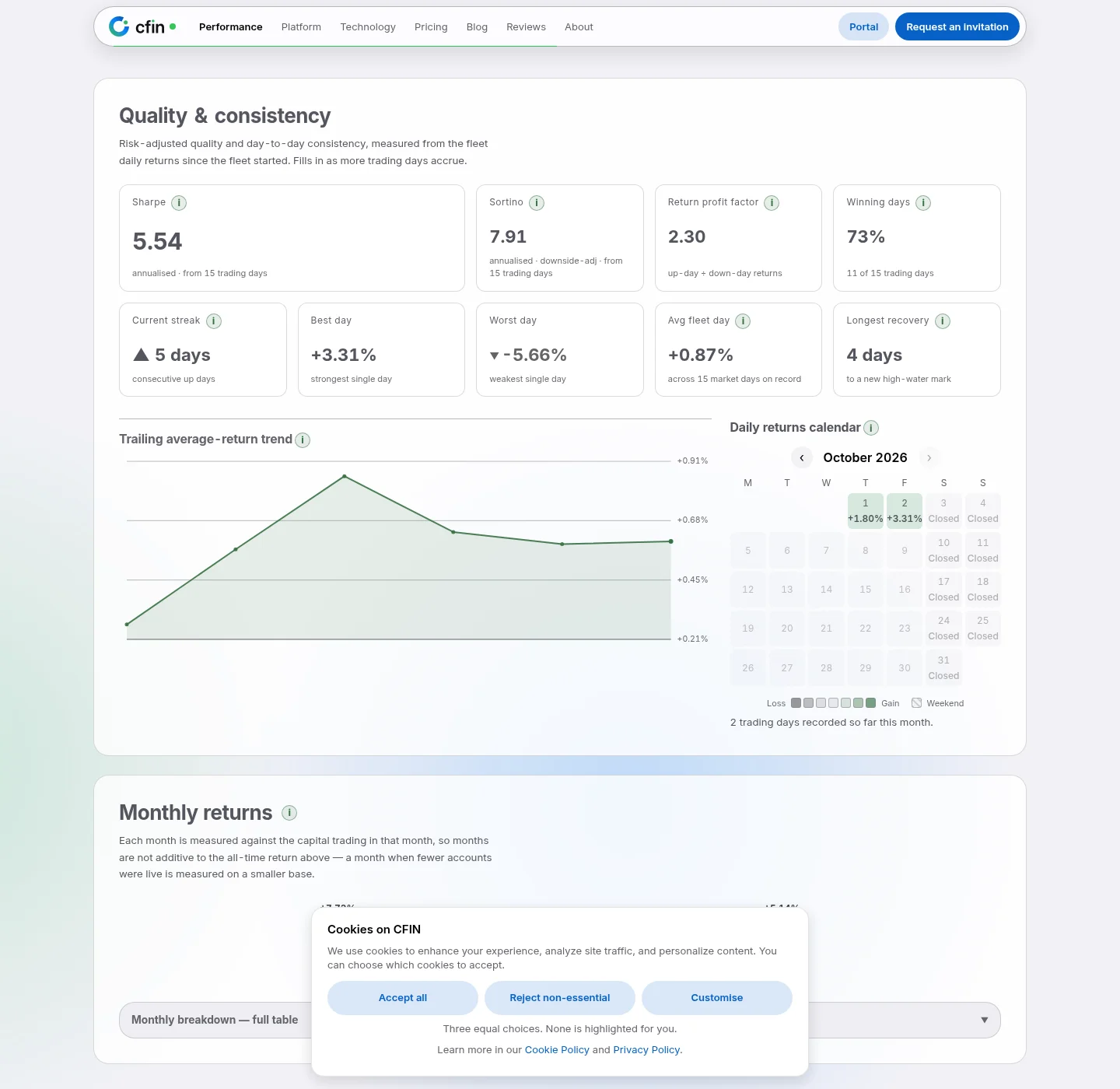
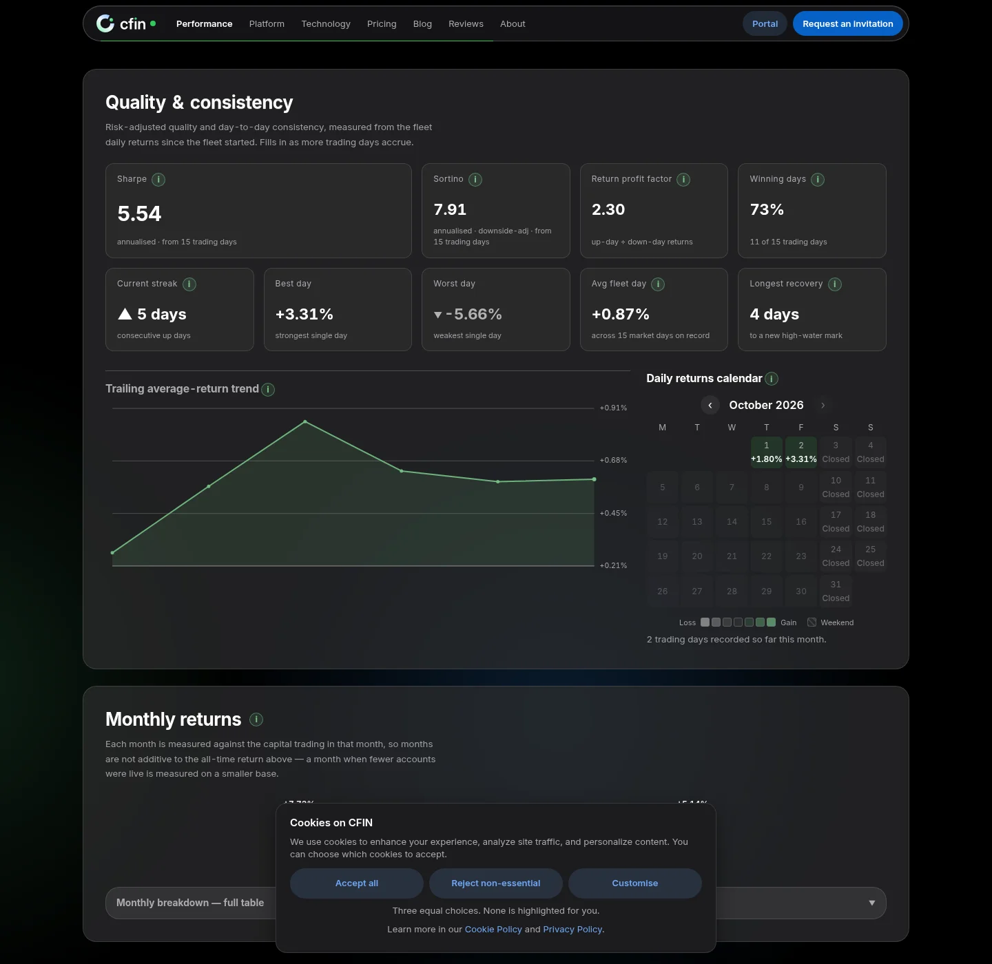
The trailing average-return trend
This chart plots a short moving average of daily return across the fleet's most recent trading days — not a single day's swing, but the trend across roughly the last six calendar weeks of actual trading activity. A short info control next to the heading explains the exact window and why trading days, not calendar days, are what the line is measured across.
The daily returns calendar, right beside it
Rather than placing the calendar somewhere else on the page, it now sits directly to the right of the trailing trend, so the two can be read together: the shape of the recent trend on one side, and the day-by-day detail behind that trend on the other. Each day is shaded by outcome — a loss shade, a gain shade, or marked as a closed weekend — and the calendar fills in as the fleet accrues more trading days.
Fleet chips carry their own mini chart
Further down the page, individual fleet chips — one per account with a return series to show — each carry a small sparkline of their own, giving a shape to scan rather than only a number to read. It is a glance-level signal, not a substitute for the detailed charts and tables elsewhere on the page.
Quality and consistency, named plainly
The tiles above the trend chart cover risk-adjusted and day-to-day measures: Sharpe and Sortino ratios (both annualised), a return profit factor worked out from up-day and down-day returns, the share of winning trading days, the current streak of consecutive up days, the single best and worst days on record, and the average return across every trading day on record. Each tile states the window it is measured over directly underneath the figure, rather than leaving the reader to guess whether a number covers a week, a month, or the fleet's whole history.
Monthly returns, kept on a comparable basis
Further down the page, a “Monthly returns” section breaks the fleet's figures out by calendar month. Each month is measured against the capital actually trading during that month specifically, rather than being added on top of the all-time figure above it — the page states this directly, because a month when fewer accounts were live is measured on a correspondingly smaller base, and treating it as directly additive to the all-time number would overstate what that month alone contributed.
How to read the page, start to finish
- Start at the summary tiles near the top for the headline figures.
- Move to “Quality & consistency” for risk-adjusted measures — Sharpe, Sortino, profit factor, winning-day share, current streak, best and worst single days.
- Read the trailing average-return trend and the daily calendar side by side for the recent shape of trading.
- Use “Explore the fleet” to filter by strategy, risk, behaviour or account for a deeper breakdown.
A note on the numbers
Every figure on the page is aggregated from broker account data across accounts running the software, excludes broker credit, and updates automatically as trading continues. Figures describe CFIN's own fleet as disclosed in the alpha banner on every public page, not a projection for any individual account, and nothing on the page is a promise about what any account will do going forward.
A note on reading results
The figures on the performance page describe what CFIN's own fleet did in the past. They are not a forecast, a promise or advice, and they do not describe what your own account will do. Past performance is not a reliable indicator of future results. Trading carries risk and you can lose money.