- 404 and payment-result pages redesigned around one rule: the tone follows severity, and it's never red
- Payment result page now states plainly when there's nothing to confirm, and that nothing's been charged
- Both pages now carry the CFIN brand mark, which they previously lacked
The pages you only see when something has not gone quite as planned — a mistyped link, or landing on the payment result screen without an actual payment to confirm — have had the same redesign pass as the rest of the public site, built around one rule: the tone follows severity, and it is never red.
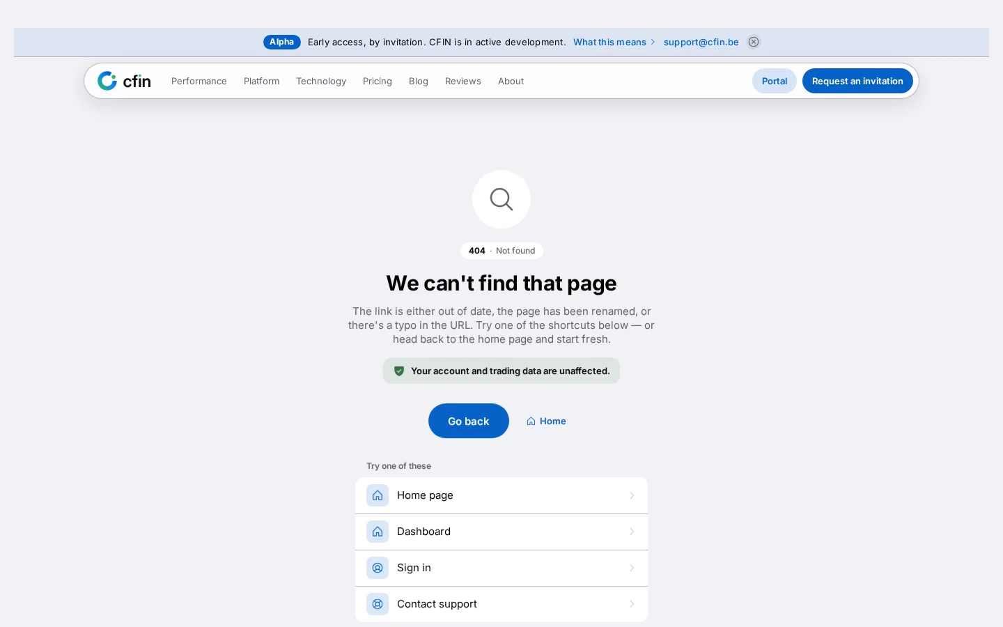




The 404 page
Landing on a link that no longer exists shows a plain heading — “We can't find that page” — with a short explanation that the link is likely out of date, renamed, or mistyped, and a direct reassurance underneath: your account and trading data are unaffected. Below that sit a “Go back” button, a link home, and a short list of likely next steps: the home page, the dashboard, sign in, and contacting support.
The payment result page
This page shows the outcome of a payment, and is the one place a visit without the right context is actually common — a bookmark, the back button, or a shared link, landing you here with nothing for the page to confirm. In that case it says so directly: “Nothing to show here. This page shows the result of a payment, and this visit does not carry one.” It also states plainly that nothing has been charged and nothing is wrong, rather than leaving that ambiguous.
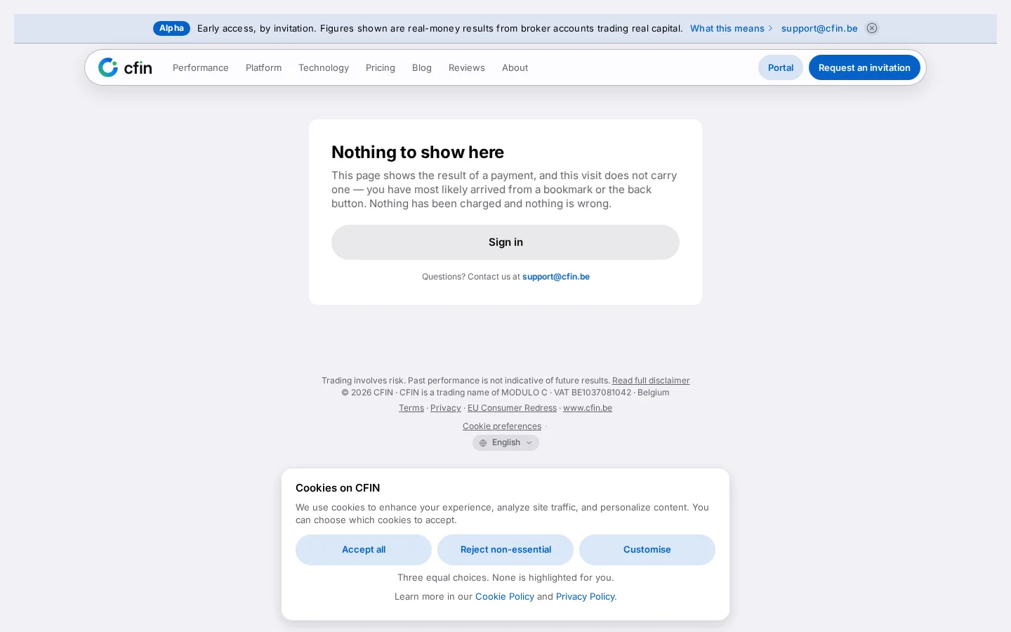
A deliberate design choice: no red
Where a confirmed problem needs attention, the page uses an amber tone, not red — reserved for something you can actually act on. Where the situation is simply “not found” or “nothing to confirm”, the page uses the same calm accent colour as the rest of the site. Red specifically is avoided across every system page, so that landing on one of these screens does not read as alarming by colour alone, independent of what actually happened.
Shared conveniences
- A “Copy error details” control on the 404 page copies technical details to your clipboard, useful if you are reporting the broken link to support.
- Both pages carry the full public site header and footer — including the risk disclosure, the legal entity, and the cookie-preferences link — rather than a stripped-down page with no way back into the rest of the site.
A third state: payment cancelled
A related screen handles the case where a payment was actively cancelled rather than simply never started — reached, for example, by stepping back out of a payment provider's own page partway through. It carries the same calm tone as the other two: “Payment cancelled. No worries! Your payment was cancelled and you haven't been charged. You can try again whenever you're ready.”
A short step indicator above the heading shows this as the third of three steps, with the first two marked done and the payment step itself marked current but not completed. That makes it visually clear this happened partway through a process rather than from a standing start.
A mark on the page, where there used to be none
Both the payment result page and the payment-cancelled page previously carried no CFIN mark of any kind — an empty override had removed it, leaving these two screens as the only pages on the public site with nothing at the top identifying where you were. They now inherit the same brand lockup every other public and auth page carries, so a payment-related screen no longer looks unbranded compared to the rest of the site around it.