- Dark mode checked component by component, not only as whole-page screenshots
- Covers the fee calculator, limits control, corner chat, cookie sheet and Performance charts
- Appearance follows your device or browser setting; there's no separate toggle on public pages
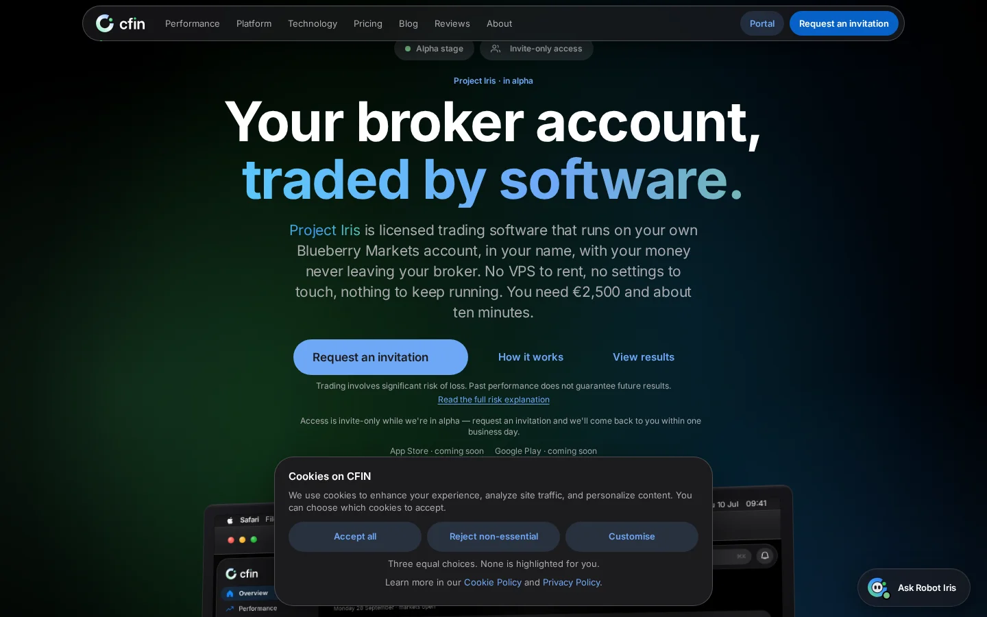
CFIN follows your device or browser's own light or dark appearance setting throughout the public site. That part is not new. What this pass addressed was narrower and more specific: checking individual components, one at a time, for places where the dark version had quietly fallen out of step with the light one.
Why a component-by-component pass
A whole-page screenshot comparison can look fine while still hiding a specific control that renders awkwardly — low contrast against its own background, a border that disappears, or a state that was only ever tested in light mode. Working through individual components rather than only whole pages is slower, but it is the only way to actually catch a defect scoped to one control rather than the page around it.
What was checked this pass
- The fee calculator — sliders, scenario cards, the output card and its timeline.
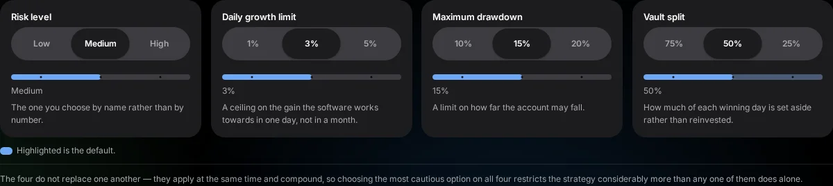
- The segmented limits control on the homepage.
- The corner chat bubble and panel, including the theme-matched avatar.
- The cookie consent sheet.
- The Performance page's trailing trend chart and daily returns calendar.
How the switch works
There is no separate dark-mode toggle on the public marketing pages; appearance follows your operating system's own setting, the same mechanism used throughout. On iPhone and iPad specifically, that means the system Settings app's Display & Brightness screen — Automatic, Light or Dark — is what CFIN follows. Where an in-app toggle is offered inside the dashboard itself, that is covered in a separate post, since it is a logged-in feature rather than a public-page one.
Motion preferences carry over to both appearances
Anyone with a reduced-motion preference set at the operating-system level sees that respected identically whether their appearance is light or dark — ambient drift effects, reveal animations and the limits control's fill indicator all skip their transition and settle straight into position, in both themes, rather than only being checked against one of the two.
How CFIN decides which appearance to show
There is no separate light-or-dark switch sitting on the public marketing pages themselves; appearance follows the operating system or browser setting you already have. A small inline check runs as early as possible in the page, before most of the page has rendered, specifically so the correct appearance applies from the very first paint rather than flashing briefly in the wrong one and then correcting itself a moment later — a visible flicker that a later, more conventional stylesheet-based switch would not avoid on its own.
Why checking component by component actually found things
A full-page comparison between light and dark versions of the homepage, taken as two whole screenshots, tends to draw the eye to large, obvious areas — the hero, the main background — and past smaller controls sitting within them. Several of the specific issues this pass corrected were exactly that kind of small, easy-to-miss case: a control that was perfectly legible on its own backdrop but whose border or fill happened to read correctly in one theme and only barely in the other. None of those would reliably surface from a glance at two full-page screenshots side by side; they surfaced from deliberately opening each component on its own, in both themes, and comparing it against itself.
How to check it yourself
- Switch your device or browser between light and dark appearance.
- Revisit the homepage, the Performance page and the fee calculator.
- The layout, spacing and content should be identical between the two — only colour values should change.
- Open the corner chat and the cookie sheet in both appearances and confirm text stays readable against its background in each.