- A scroll-reveal animation was wrapping the limits control's preset buttons in a hidden container
- Screen readers could not see the buttons, and they also rendered squashed to uneven widths
- Fixed by excluding the limits control from that animation's selector; both symptoms are gone
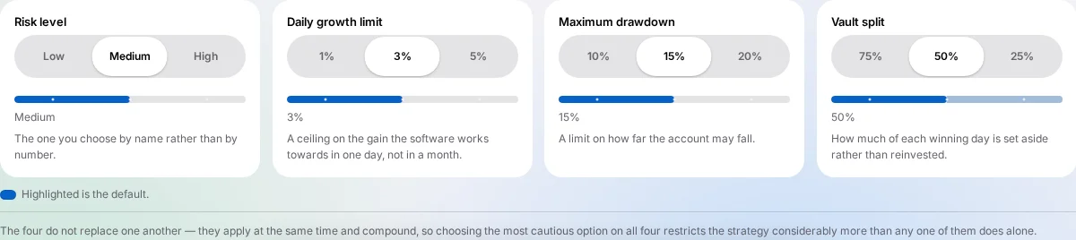
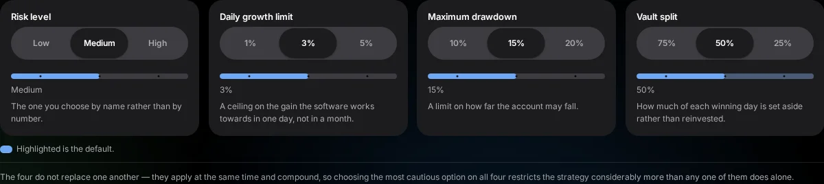
A specific defect on the homepage's segmented limits control has been fixed, and it is worth describing plainly because of what caused it: a scroll-reveal animation, written for ordinary paragraph text, was accidentally also matching the limits control's preset buttons — with two separate, compounding effects.


What was actually happening
A line-splitting animation used elsewhere on the page to reveal paragraph text, line by line, as you scroll to it, was written broadly enough that it also matched the markup around the limits control's preset buttons. That animation wraps text it matches in a container marked hidden from assistive technology until the reveal completes — so the buttons inside the limits control were, in effect, invisible to a screen reader, not because anyone intended to hide them, but because a selector written for paragraphs happened to also catch this control.
A second, visible symptom
The same wrapping also pulled the buttons out of their normal layout flow, so instead of sharing the row's width evenly, they sat at whatever width their own content needed — uneven and cramped against the left edge of the control. This is, in fact, how the defect was first noticed at all: a visibly uneven row prompted a closer look, which is what led to finding the accessibility problem underneath it.
The fix
The scroll-reveal animation's selector now explicitly excludes the limits control, so it no longer wraps those buttons in a hidden container at all. With that wrapper gone, the buttons sit back in their normal layout and share the row's width evenly — measured at an identical width per option, both on a full-width desktop layout and at phone width.
Why this kind of defect is worth writing up
Nobody set out to hide an interactive control from assistive technology; a general-purpose animation and a specific control's markup simply overlapped in a way neither side anticipated. It is a useful reminder that an accessibility regression does not have to come from a change aimed at accessibility at all — a scroll animation written for ordinary text can just as easily be the cause, which is exactly what happened here.
What was actually measured, after the fix
Once the exclusion was in place, the four preset buttons inside each of the four controls were measured sharing an identical width per option on a full desktop layout, and again at phone width — a consistent, even split in both cases, with the selection indicator correctly aligned under whichever option was active. No button remained wrapped in a hidden container at either width, which was the specific condition checked to confirm the screen-reader-visibility side of the fix, not only the visual one.
How it was first reported
The issue was first raised as a visual complaint — the percentages inside the control were not sharing their row equally, with some clearly narrower than others. That observation on its own gave no reason to suspect an accessibility problem; it read as an ordinary layout bug. It was only once the cause was traced to a generic reveal animation wrapping the buttons in an additional container that the second effect of that same wrapping — the container being marked hidden from assistive technology — came to light. The visual symptom and the accessibility defect shared one root cause, even though only one of the two was visible without specifically checking for it.
Why a general-purpose animation needed a specific exclusion
The reveal animation in question is used widely across the homepage, applied broadly to paragraph text so that sections animate into view as a visitor scrolls to them. Writing it broadly enough to catch every paragraph on the page is exactly what let it also catch markup it was never intended for. Rather than narrowing the animation's broad paragraph selector in a way that might miss some other paragraph elsewhere on the page, the fix instead explicitly excludes the limits control's own container by name — a narrow, targeted exception rather than a broad rewrite of a rule used in many other places.