

- Vault story section on the homepage restyled to match the new design
- Scroll choreography, sticky chart and figures are unchanged
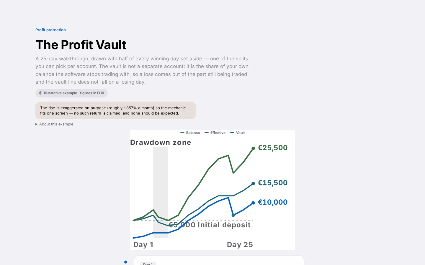
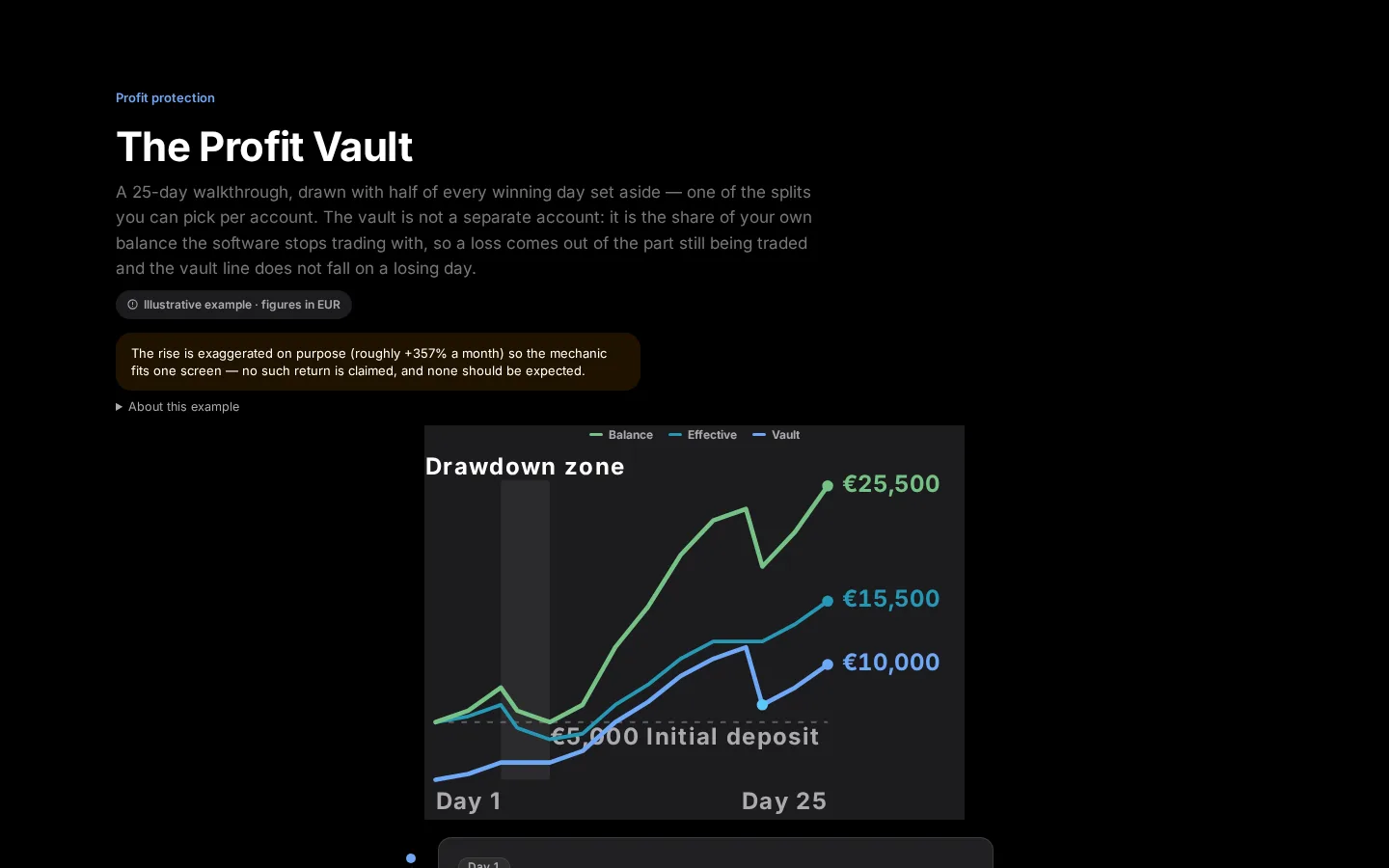
- Illustrative chart stays exaggerated on purpose, so it's never mistaken for a guarantee
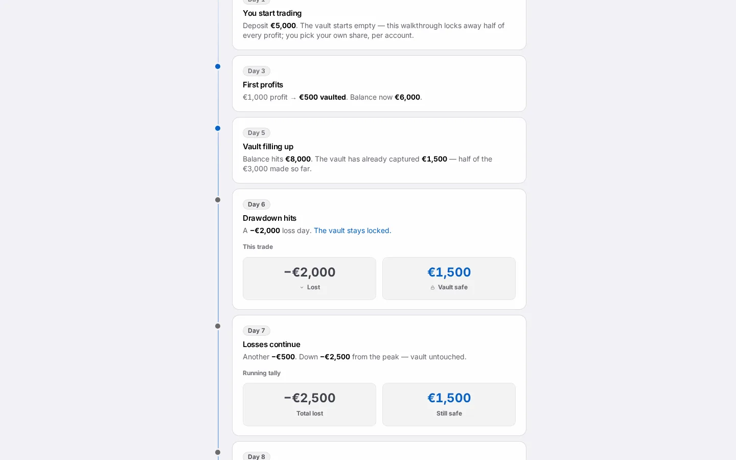
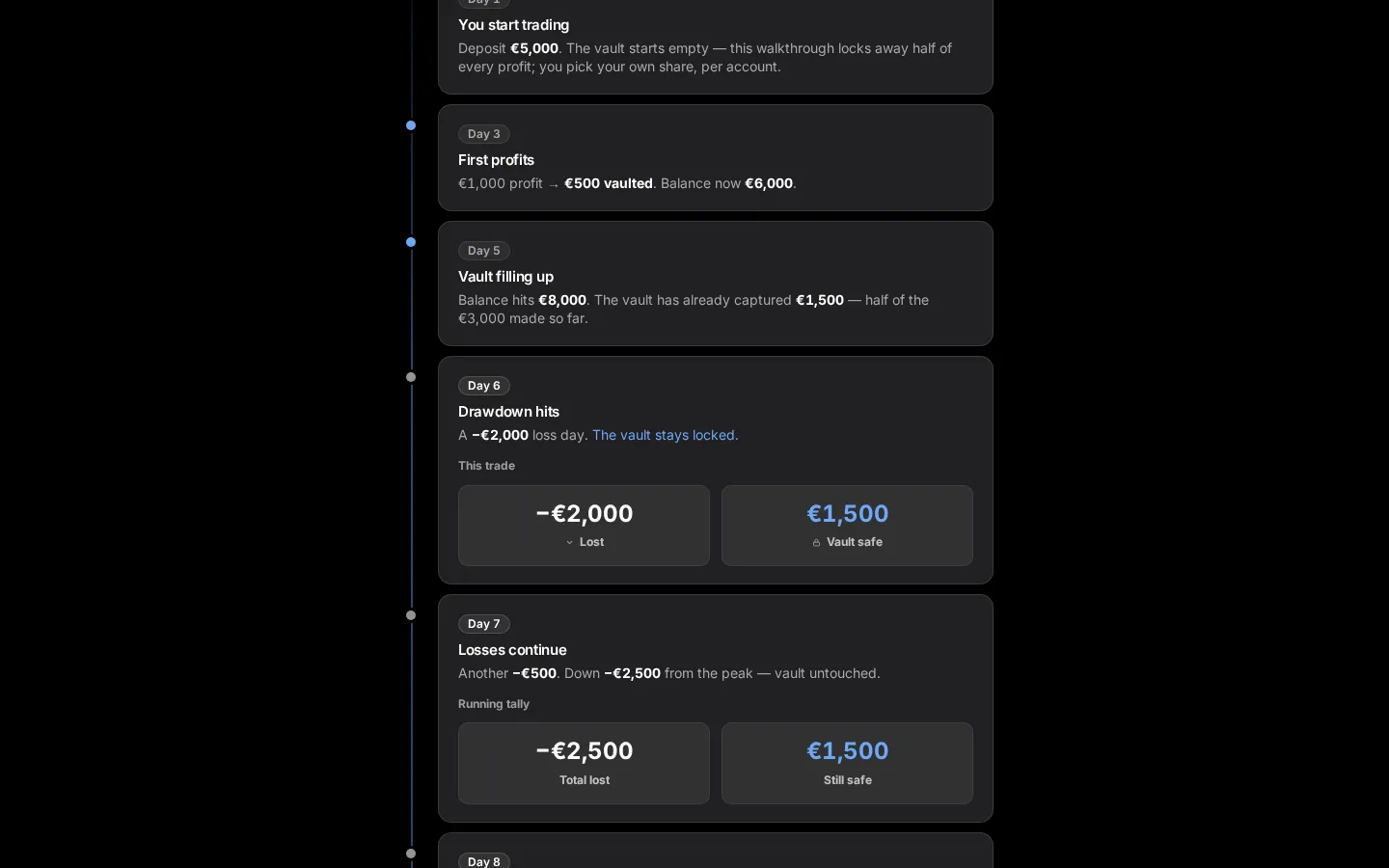
Further down the CFIN homepage, a vertical, scroll-triggered section tells the story of how the Vault builds up over time, with a sticky chart that stays in view while the surrounding text advances. We've restyled this section's look — type, colour and cards — to match the rest of the redesigned site, while leaving its proven scroll behaviour untouched.


Why we left the behaviour alone
This section's interaction design already worked well, so our focus here was a visual refresh rather than a rebuild. Keeping a familiar, well-tested interaction reduces the risk of breaking something customers already understood.
What you need to do
Nothing — scroll through the Vault story section on the homepage to see the refreshed version.
In detail
- A sticky chart stays in view while supporting text and figures advance as you scroll past them.
- The section tells the story of how the Vault builds up over an extended period, with a deliberately exaggerated illustrative counterweight kept visible so the chart is never mistaken for a literal promise.
- The choreography and sticky behaviour are unchanged from the previous homepage.
- Figures in this section are drawn from their real sources, the same as everywhere else on the site.
The illustrative chart, kept honest
The exaggerated counterweight in this section is a deliberate storytelling device, not a forecast. It exists specifically so the sticky chart can never be mistaken for a prediction or guarantee, and that distinction carried straight through the restyle.
We also re-checked every figure quoted here against its live source, rather than assuming numbers written for the old version were still current.