

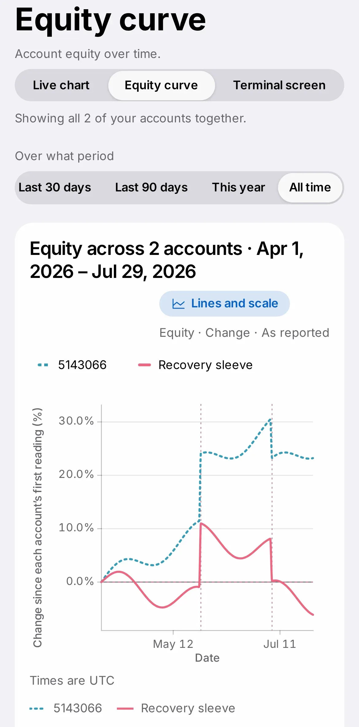
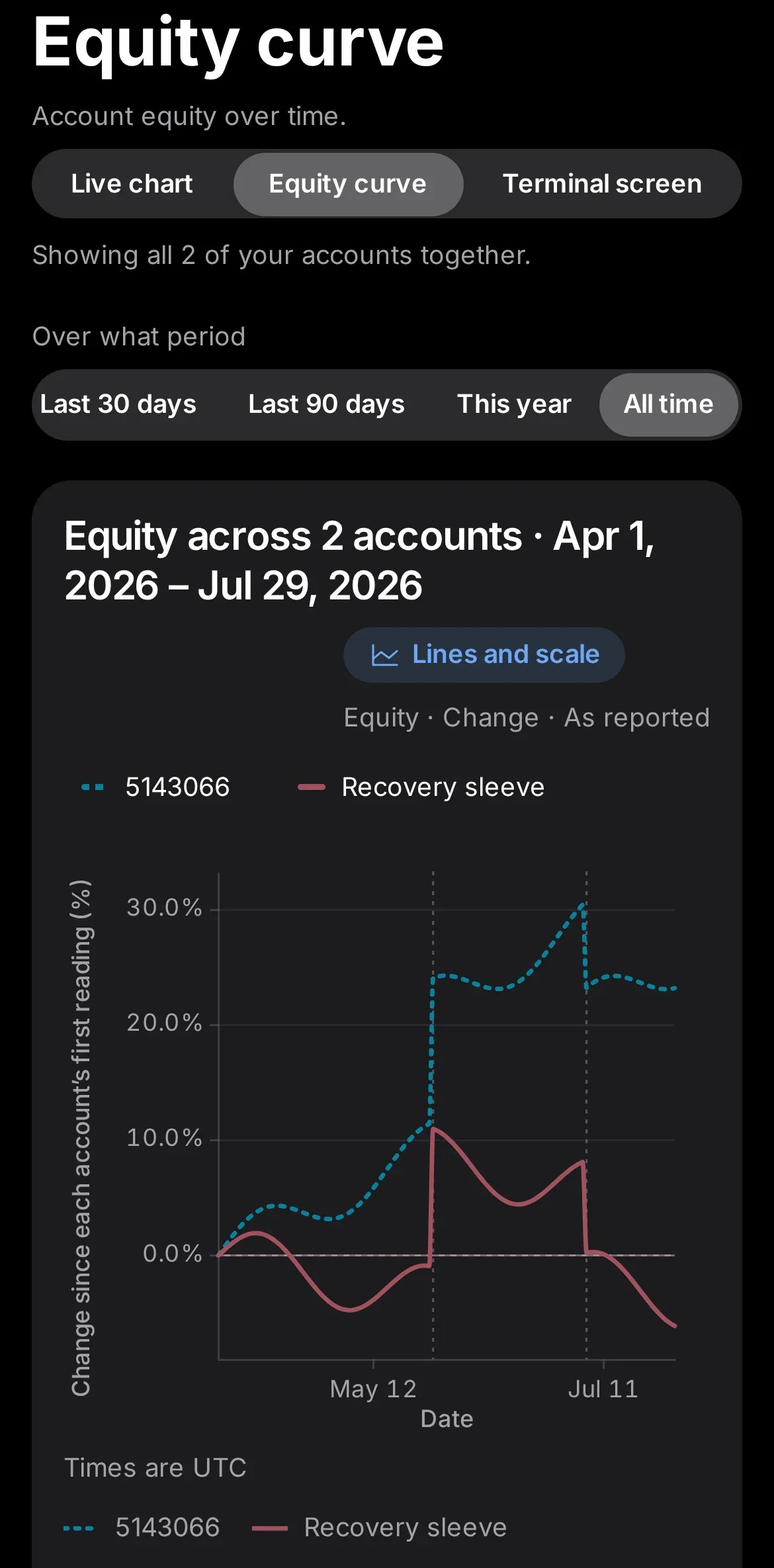
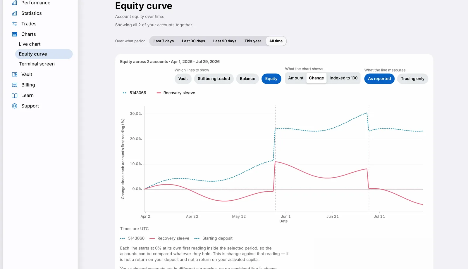
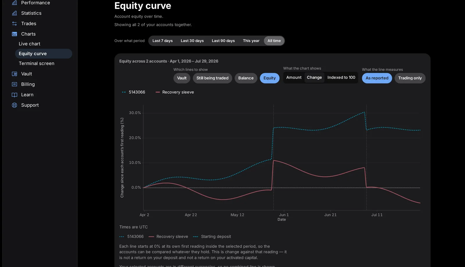
- Every redesigned page is built and reviewed in both light and dark appearance together
- Dark mode uses a true black background and dark grey cards, not a simple colour inversion
- Appearance follows your device or browser setting automatically as more pages migrate
As each CFIN dashboard and public page moves to the new design, it is now built and reviewed in both light and dark appearance from the start, on desktop, tablet and phone sizes alike. In dark mode, pages use a true black background with dark grey cards, rather than a simple colour inversion of the light version, so switching appearance on any redesigned page should feel equally considered either way.
What changed
Every redesigned page is reviewed in both appearances before it ships. Dark mode is not a simple inversion of light mode — it uses a true black background with dark grey cards, built from the same underlying colour tokens as the light version.




Why it matters
Many products treat dark mode as a filter applied after the fact, which often leaves low-contrast text or a card that barely stands out from its background. Designing both appearances side by side from the start means dark mode is a first-class experience, not a compromise.
What you need to do
Switch appearance using your device or browser's own light/dark setting, or an in-app toggle where one is offered. Redesigned CFIN pages will follow it correctly.
If you spot a page that still looks unfinished in one mode, it likely has not been migrated to the new design yet — more pages are shipping continually.
In detail
- Every redesigned page is reviewed in both appearances, on Mac, iPad and iPhone sizes, before it ships.
- Dark mode uses a genuine black page background with distinct dark grey cards, so content still stands out clearly.
- Charts, tables and figures keep the same colour meaning (green profit, grey loss) in both appearances.
- A page that has not yet moved to the new design will still show in its older style until its turn comes.
One more thing
Testing both appearances together, rather than treating dark mode as an afterthought, caught a number of small issues early — a card that blended into its background, or text that was technically readable but uncomfortable to stare at for long.
As more pages move to the new design, you should notice fewer and fewer places where switching appearance produces an awkward result.
We treat this as an ongoing discipline rather than a one-time check: whenever a new component is added to the shared kit, it is reviewed in both appearances before it is allowed to ship on any page, so the two modes never drift apart again later.